The vision for my new website started with an image in my head, a favorite color, and my obsession with finding the perfect font.
If you’ve worked with me for a while, you may receive random text messages with out-of-context ideas. The one I sent to my designer friend Vanessa said something like: “Can you make a chubby pen that is cute and old school but not like a fountain pen?”
When it comes to client projects, I start with a structured outline that becomes a game plan. When I’m working on my own projects, I prefer a free-style approach.
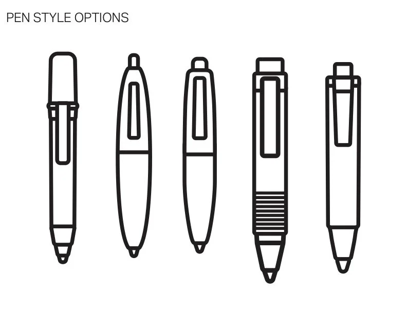
Vanessa sent me five illustrations of pens along with font options that might go with the pen. Even though she didn’t have much information to work with, she knew that finding the right font would be important for whatever I was working on.
I narrowed down the pen options to two and was able to eliminate the fonts I didn’t like. I wasn’t ready to discuss a color palette yet but I knew I wanted to incorporate the color purple.
When I had my first planning session with Bridget Baker to work on my website, she asked me if I had brand assets. I said ‘sure’ with confidence. I later explained that I had the start of a logo, the beginnings of a color palette, the ideas of what fonts might work, and a laundry list of what I did not want.
Because she is an accomplished brand accomplice, Bridget could work with that.
Before she became a brand builder and creative coach, Bridget was a ballerina dancer and choreographer. So it makes sense that we were able to collaborate so well together. It did feel like dancing with a skilled partner who could take the lead but also flow in a different direction.
Once we decided the purpose of my website and my priorities for how it would function, it was time to return to the logo and get that nailed down.
Selecting the type of pen was the easiest part. I wanted a font to go with it that was similar to handwriting. I tend to be very selective about fonts and it’s important to find the perfect one for a project.
When you select a font, you have to really study how it will look in all scenarios. There is nothing worse than realizing the font you picked has a really odd lower ‘g’ or a wonky capital ‘B.’ You really have to study each and every letter.
After many email exchanges and text messages, Vanessa found the font that would work best for the logo. This font would also be used for headings and anything that needed a little pizazz. The next step was to find a font that complemented the logo and would work for the rest of the site.
Deciding on a color palette was a bit easier. I wanted purple to be the primary color so now we had to decide what kind of purple.
Side note: I’ve seen some people mention that we can’t use purple anymore because GenAI loves purple and a lot of AI-generated web designs feature purple. Nonsense! Purple is the color of the late artist Prince and also belongs to the fandom of the Korean group BTS. I refuse to let AI claim purple!
Once the logo was almost final, I sent that to Bridget and we decided on typography and colors. In terms of imagery, I know I wanted pens somewhere on the site. I also wanted to incorporate crystals like amethyst as a background texture.
All of these discussions happened before I wrote a single word of copy. Once I explained my vision, I could trust Bridget to run with it while I moved onto the copywriting stage.
“Trust the process” is not just a saying. This is what the process looks like when you find collaborative partners who trust your vision.
When I mentioned I was working on my website, a few people told me, “you know you could vibe-code that, right?” I could but I don’t want a website that looks like other websites. I wanted something that looked like it was plucked from my mind, which is equally structured and chaotic. That’s the beauty of finding the right collaborator.
If you’re looking for creative partners, I highly recommend working with Bridget Baker for your website and branding needs and with Vanessa Ramirez for graphic design.
Next time I’ll talk about my writing process behind this website and how I almost crashed out before taking it into a new direction.